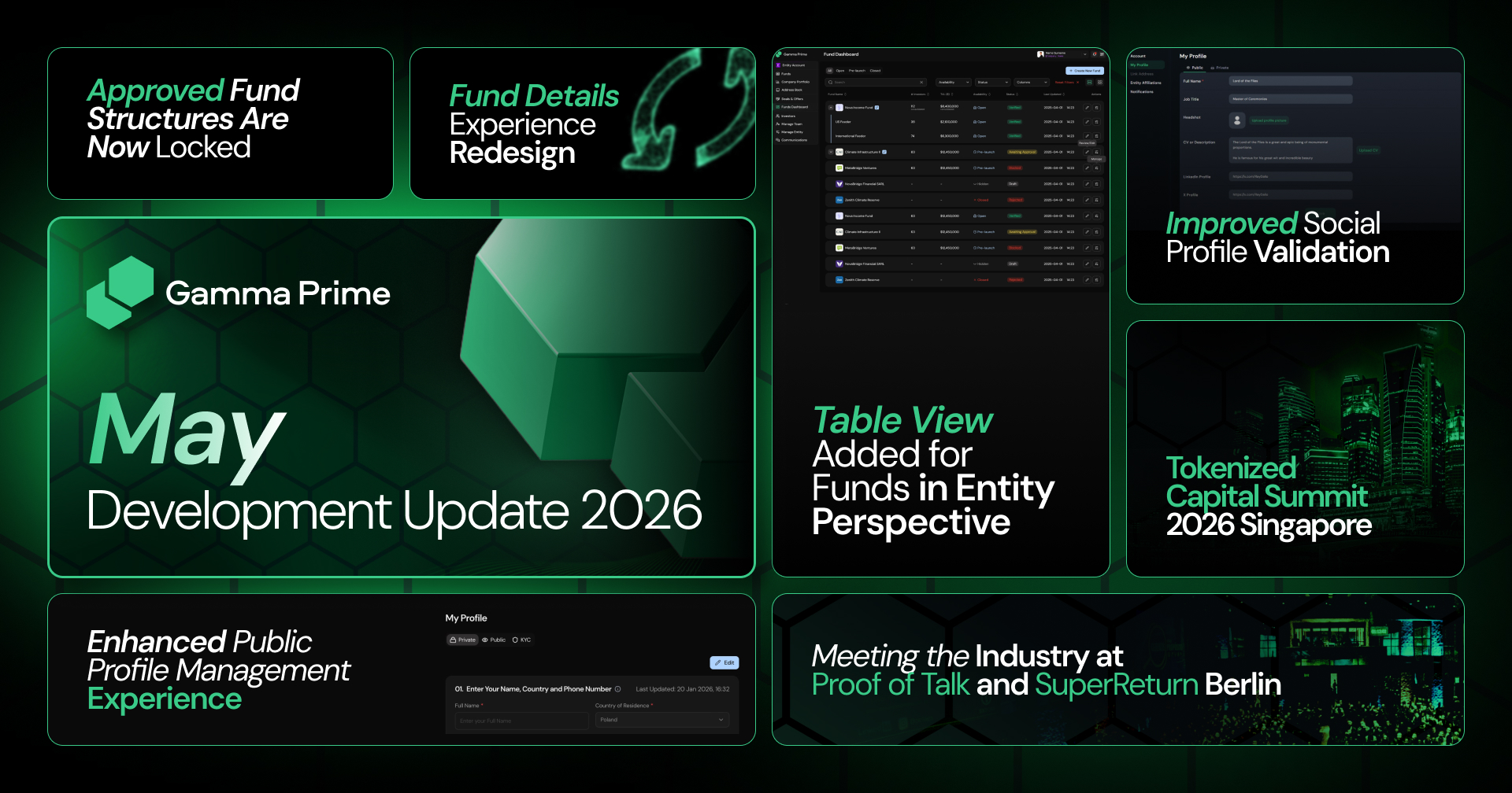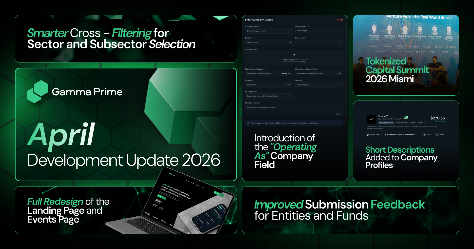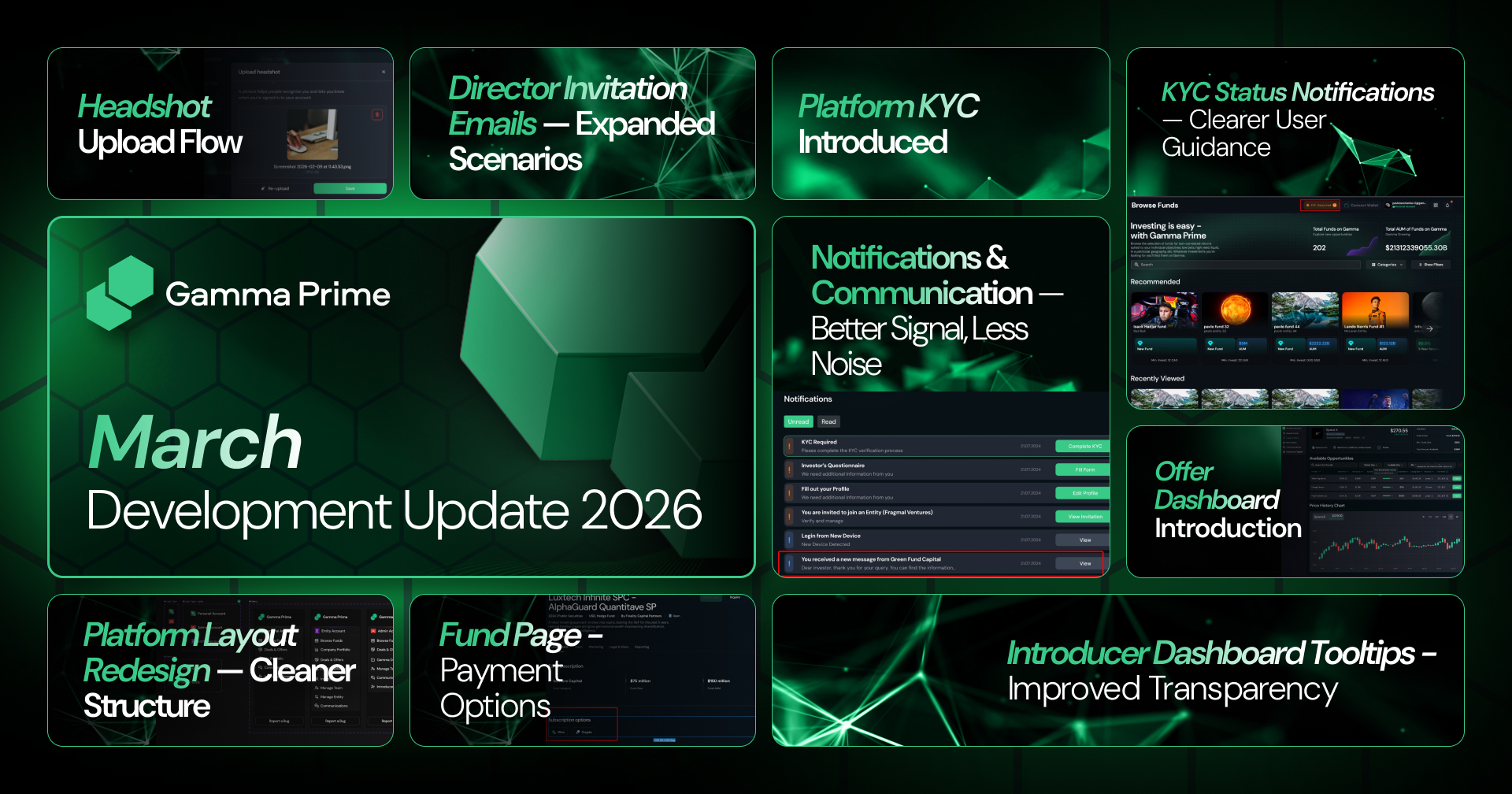
Published on March 31, 2026
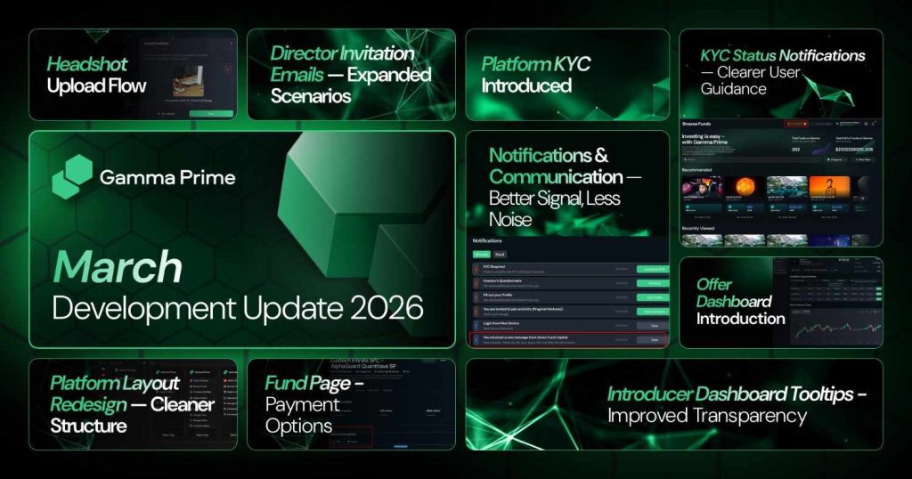
March was a month dedicated to refining the experience across the platform – not by introducing isolated features, but by improving how everything works together. We focused on clarity, predictability, and trust: making sure users always understand their current state, their next step, and the outcomes of their actions. From onboarding and compliance to investment flows and communication, each update was designed to reduce friction and bring the product closer to the standard expected in institutional environments.
Tokenized Capital Summit 2026 Miami
In March, we officially began preparations for Tokenized Capital Summit 2026 Miami, marking the start of a new chapter in expanding our event series into one of the most active global hubs for capital and digital assets. Miami was selected intentionally – not just for its market relevance, but for its strong intersection of institutional finance, emerging technology, and global investor presence. The event will take place on May 4th.
A key priority in early planning is audience curation. The goal is to bring together a concentrated group of decision-makers, including C-level executives, HNWIs, family offices, and institutional participants, ensuring that every interaction within the event environment is relevant and actionable.
As we move forward with preparation, the focus remains on building an environment where conversations translate into real outcomes – not just visibility, but capital, partnerships, and long-term collaboration.
KYC Status Notifications – Clearer Guidance
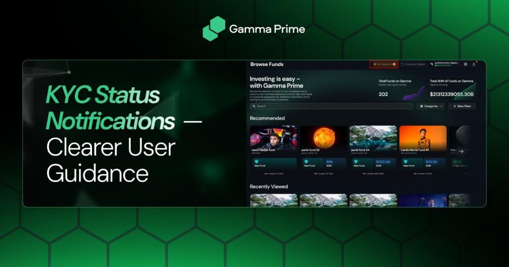
We revisited how KYC statuses are communicated across the platform to eliminate uncertainty during one of the most critical steps in the user journey. Previously, status indicators could feel ambiguous or too technical, which often led to confusion about what action was required. With this update, each KYC state now delivers a clear, human-readable message aligned with the user’s situation.
When verification is pending, users are explicitly guided toward completing their KYC rather than being left in a passive state. In cases where verification has been rejected, the system now communicates this transparently, accompanied by a clear explanation and encouragement to review and resubmit information. For users whose verification is under review, the messaging now reinforces that the process is actively progressing, removing unnecessary anxiety and support requests.
This improvement ensures that onboarding feels guided rather than uncertain, helping users move toward activation with confidence.
Introducer Dashboard Tooltips – Improved Transparency

We significantly upgraded tooltip messaging across the Introducer Dashboard to make the mechanics behind rewards, eligibility, and activity fully transparent. The introducer system contains multiple layers – from fund introductions and referral timelines to reward structures – and our goal was to make these dynamics instantly understandable without requiring external explanation.
Each tooltip has been rewritten to provide precise context around what is happening at any given moment. Whether it is an investment event, a withdrawal, or a referral milestone, users can now clearly see how their actions or the actions of their referrals translate into rewards. Special attention was given to eligibility windows, expiration conditions, and scenarios where rewards may not apply, ensuring there are no hidden assumptions.
By improving clarity at the point of interaction, we reduce friction for introducers and allow them to operate with a stronger sense of control and predictability.
Notifications & Communication Updates
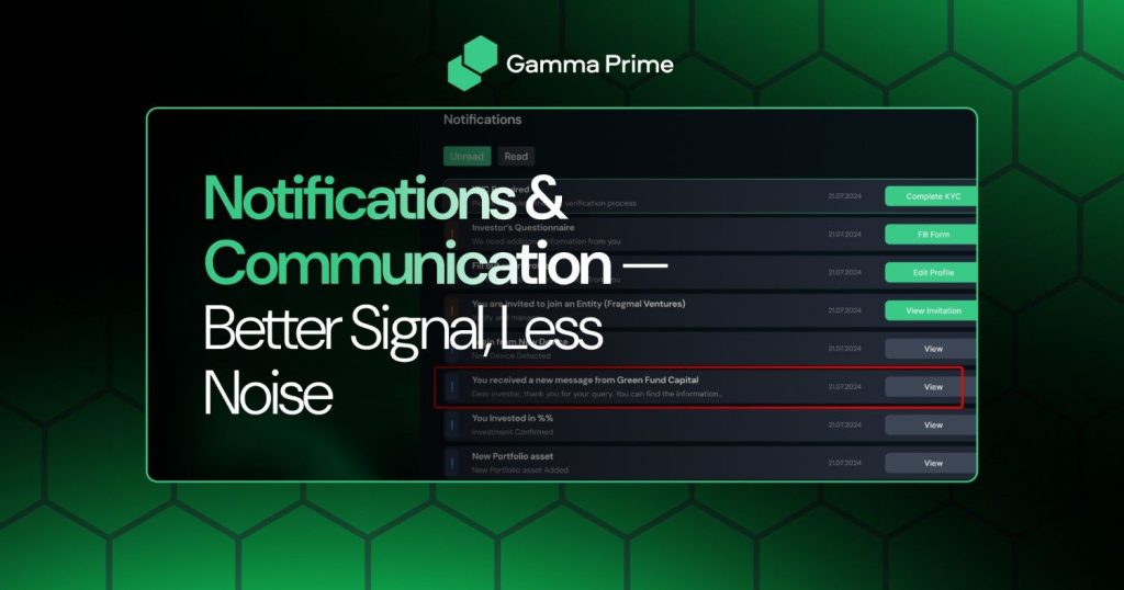
We refined the relationship between notifications and the Communications module to create a more balanced and intentional system. Previously, users could receive alerts even when they were actively engaged in the same conversation, leading to unnecessary noise and distraction.
With this update, notifications are now context-aware. If a user is currently viewing an active chat, redundant notifications are suppressed, allowing them to focus on the conversation without interruption. At the same time, all important updates are still captured and organized within the Notification Center, ensuring that no critical information is lost.
This change improves the overall communication experience by maintaining awareness without overwhelming the user – striking the right balance between responsiveness and simplicity.
Director Invitation Emails – Expanded Scenarios
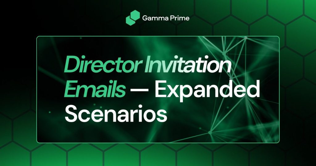
We expanded the logic behind Director-level invitation emails to ensure that every possible user state is handled clearly and consistently. Being granted Director access is a high-trust action, and the communication surrounding it needs to reflect both clarity and security.
For existing users, invitations now clearly indicate that access has already been granted, along with direct instructions on how to view and manage their new permissions. For users who are not yet registered on the platform, the flow has been structured to guide them through account creation while maintaining a seamless transition into their new role.
Across both scenarios, we reinforced security messaging to ensure users understand how to safely interact with the platform. These updates ensure that onboarding into sensitive roles like Director is both intuitive and aligned with best practices.
Fund Page – Payment Options
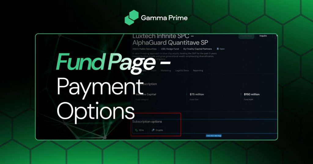
We introduced clearer visibility into payment methods directly within individual Fund pages, addressing a key moment in the investment journey. Previously, users often needed to navigate multiple steps to fully understand how they could participate in a fund.
With this update, the information is presented upfront, allowing users to quickly assess how they can invest, what options are available, and what requirements apply. This reduces hesitation and simplifies decision-making at the point where intent is highest.
Platform Layout Redesign – Cleaner Structure
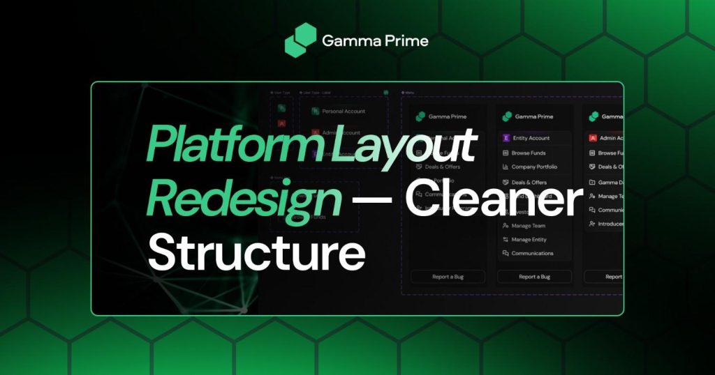
We implemented a redesign of the platform’s core layout, focusing on the sidebar, header, and footer to improve navigation and visual hierarchy. As the platform continues to grow in complexity, maintaining a clean and intuitive structure becomes essential.
The updated layout introduces a more consistent and organized interface, allowing users to move between sections more naturally. Key actions and navigation elements are now easier to locate, while the overall visual balance has been improved to reduce cognitive load.
This redesign is not just aesthetic – it directly impacts usability, helping users spend less time navigating and more time focusing on meaningful actions.
Headshot Upload Flow – Seamless Experience

We refined the headshot upload flow to make profile completion smoother and more intuitive. While seemingly a small part of the product, this step plays an important role in onboarding.
The updated flow simplifies the process, reducing unnecessary steps and making it easier for users to upload and confirm their image without friction. The experience is now more aligned with modern UX expectations, where actions feel immediate and straightforward.
KYC Process – Strengthening the Core Requirement
We continued strengthening the KYC process as a foundational component of the platform. KYC is not just a compliance requirement – it is a key element that enables secure, trusted interactions between all participants in the ecosystem.
By reinforcing KYC as a prerequisite for investment activity, we ensure that all users operate within a verified and compliant environment. This protects both investors and fund providers while maintaining the integrity of the marketplace.
Offer Dashboard – Introduction
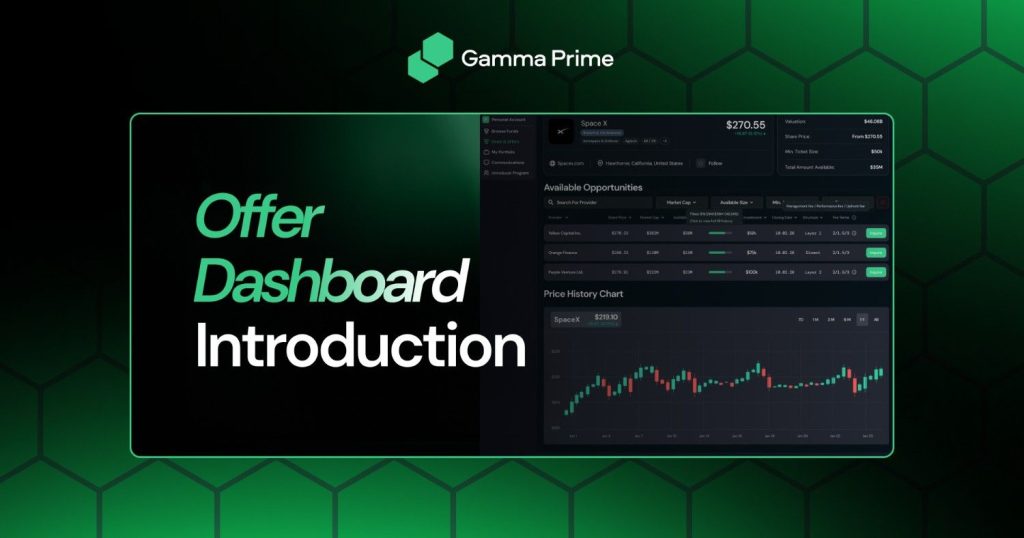
This month, we introduced the Offer Dashboard – a dedicated interface designed to present investment opportunities in a more structured and accessible way.
The dashboard allows users to explore available deals with greater clarity, and understand allocation dynamics at a glance. Information is organized in a way that supports faster evaluation, helping users make more informed decisions without navigating multiple layers of the platform.
By centralizing and structuring opportunity data, the Offer Dashboard enhances transparency and makes capital allocation more efficient.
Closing Note
March was about making the platform easier to understand and easier to trust. Each improvement was designed to remove uncertainty, streamline interaction, and reinforce the foundation we are building for long-term growth. As we move forward, our focus remains the same – delivering a product that feels simple on the surface while supporting the complexity required by institutional-grade investing.